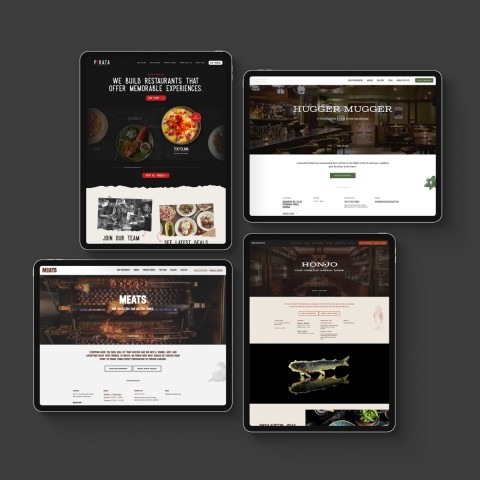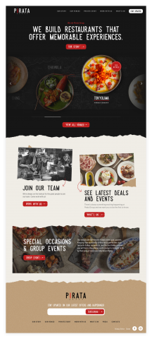
With this challenge, it was integral to prioritise defining the structure then build the UI that would cater to the different venues. This allowed us to build future sites based on those defined structures much faster, having a website up and running as soon as we get the branding guidelines. The end product not only delivers on its intention, but also one that has streamlined their internal team’s work for updates.
What first seemed like a challenge on the UI design with all the custom shapes and textures, the situation allowed our team to create solutions that in the end contributed to a unified experience without sacrificing the branding of the subsequent restaurant websites' designs.

The branding of Pirata’s venues are so different from each other that we initially thought it was going to be a challenge in building a unified experience. A good combination of careful planning and timely provided brand guidelines, we designed multiple end products that stay true to each venue’s identity and yet remain structurally familiar.
Pirata is built on WordPress as a multi-site network. We built three main structures - one for the group site and two for their venues to cater to multiple branches and single branch venues. Apart from this, the infrastructure was constructed to provide an optimised experience for their internal team as all of Pirata’s sites are centralised in one platform.
Pirata Group’s venues are so popular they’re Hong Kong’s household names. They came to us to find the most effective solution to have a unified online presence for all their venues that makes it easier for new guests to discover the different restaurants as well as provide a convenient place for patrons to stay engaged.
