With an easy to use and well thought out navigation system, some clever article links placement and better information architecture, we didn't just achieve the goals that were in the brief, we smashed it. The end product was well received by readers, halved the bounce rate, double the retention rates and page views per session.
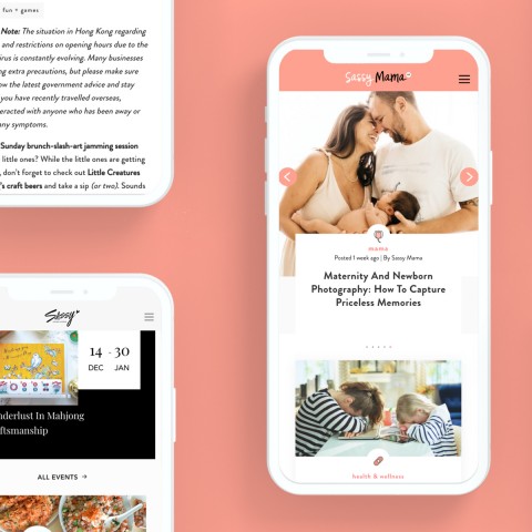
Given Sassy Mama's fun loving and family-friendly image, we opted for some homey and sweet colour scheme that matches the brand's visual identity.
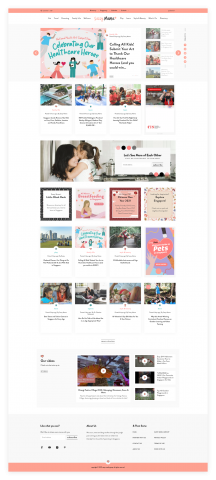
First up was to tackle the bounce rate. We had to make sure the content on the landing page is easy to read and immediately appear to be relevant to the user so that they continue browsing and exploring the content that the site has to offer. Next, we added an easy to use navigation system that made it super simple for users to find the articles that are relevant to them based on categories, themes or topics.
Similar or related articles are strategically placed so that users will continue to explore other articles. Ads are always visible but never in the way. We also added a school directory to serve parents looking for the right schools, which also had an added benefit for the site's SEO.
Keeping in line with the fun colour scheme, all icons are designed to be light and cheerful. All images have a homey, warm and friendly feel to them with a touch of sassiness that matches the brand's visual assets. Some caligraphy fonts are added to help lift this aesthetic and add a touch of a lifestyle feel to it, keeping in line with the Sassy Media Group's other brands.
The client has been using WordPress for a number of years. They are happy with its user-friendly backend interface. Since WordPress is very much designed for blog-style content distribution as well, we didn't see the need to change here. However, when we revamped the site, we rebuilt a lot of the features in-house that were previously handled by plugins to elevate the security of the platform and decrease the chance of conflicts between a long list of plugins.
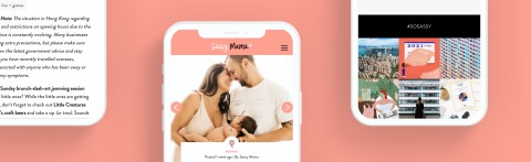
We have always wanted to work with the Sassy Media Group, so when they reached out to us to revamp their Sassy Mama brand, we were over the moon. The brief was to increase retention, cut down bounce rate and to significantly improve the mobile experience. We also added a whole directory for schools and added a bunch of other fun and 'sassy' functionalities while we were at it.